Brand Logo
Back to guides

Use Julius AI for Budgeting and Grocery Analysis

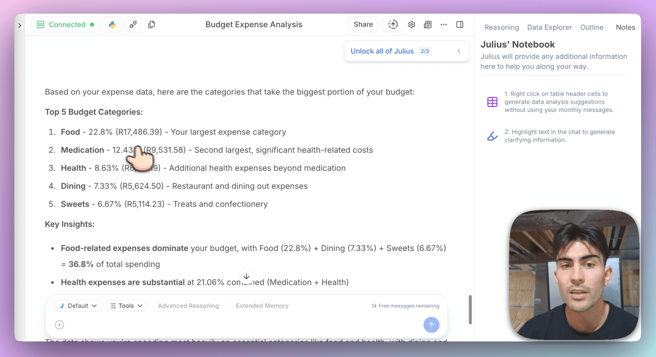
The Rundown: This is a guide I think every household should study. To use Julius AI to make sense of your grocery receipts, identify spending patterns, and get insights that help you shop smarter. Whether it's tracking which store eats most of your budget or seeing which items you always buy together, Julius takes your Excel files and turns them into clear, actionable visuals.

🧰 Who is this useful for:

  • Budget-conscious households
  • Freelancers or remote workers tracking personal expenses
  • Data-curious grocery shoppers
  • Families trying to stretch their monthly food budget
Screenshot 2025-08-15 at 11.08.13 AM.png


STEP 1: Getting Started

To start analyzing your grocery spend, go to Julius AI. Before we get started, I want to show you briefly one great feature that Julius has. On the homepage, head to the Data Connectors tab.

Click on “Add or Manage Data Connectors.” Here, you’ll see options to connect Julius to external sources like Google Drive, Microsoft OneDrive, SharePoint, Notion, and more. This is extremely useful as data lives in various places. The connectors help you access that data without friction.


STEP 2: Describe Your Dataset

Once connected, go to the Julius AI chat interface. Drag and drop your Excel file (e.g., expenses.xlsx) into the chat. I have a list of grocery expenses from various stores as my data points.

The file include fields like:

  • Product Category (e.g., Food, Alcohol, Accessories)
  • Product Name
  • Units Purchased
  • Unit Price
  • Discounts (e.g., Pensioner, Promotion)
  • Total Cost
  • Store Name
  • Purchase Month

After uploading, Julius will automatically clean and process the data for analysis.

Screenshot 2025-08-15 at 11.09.19 AM.png


STEP 3: Submit Your Analysis Request

After your data is processed, it becomes a simple conversation to gather insights. You may use natural language queries in the chat. Here are a few examples:

  • “Which categories make up most of my spending?”
    Julius returns a pie chart showing budget distribution across categories like Food, Medication, Cleaning Products, etc.
image-2014.png


  • “Which store do I spend the most money at?”
    See a bar chart of total spending per retailer (e.g., Spar, Checkers, Makro) with insights like number of purchases and average purchase value.
image-2013.png


  • “Compare prices for products across stores.”
    Julius shows product price differences by store. This is my favourite part as I now know which products to buy at which stores for massive savings. For example, dog food might cost $42 at Spar vs. $279 at Checkers.
image-2012.png


  • “What are the most frequently bought items?”
    Discover high-frequency low-cost items (e.g., carry bags, bread) vs. low-frequency high-cost items (e.g., medication, pet food).
image-2011.png


  • “Which items are commonly bought together?”
    Julius shows item pairs bought together most often. This is useful if you want to bundle certain purchases or understand your spending patterns. Example: Bread + Carry Bag, Coke + Portuguese Rolls, Bananas + Onions.


STEP 4: Visualize and Act on Your Insights

Julius generates visualizations like pie charts, bar graphs, and frequency tables that you can interpret at a glance. It's colorful and probably the easiest way I've found to get rich insights from my data.

Pro Tip: Run this monthly to spot trends, price increases, or to identify which items you can substitute or buy in bulk. Planning based on actual behavior is far more powerful than guessing.